Photography Portfolio Website
A production-ready photography portfolio site for a solo photographer, built with Next.js (App Router), TypeScript, Tailwind CSS, and a headless Sanity CMS backend.
Collaboration & Requirements
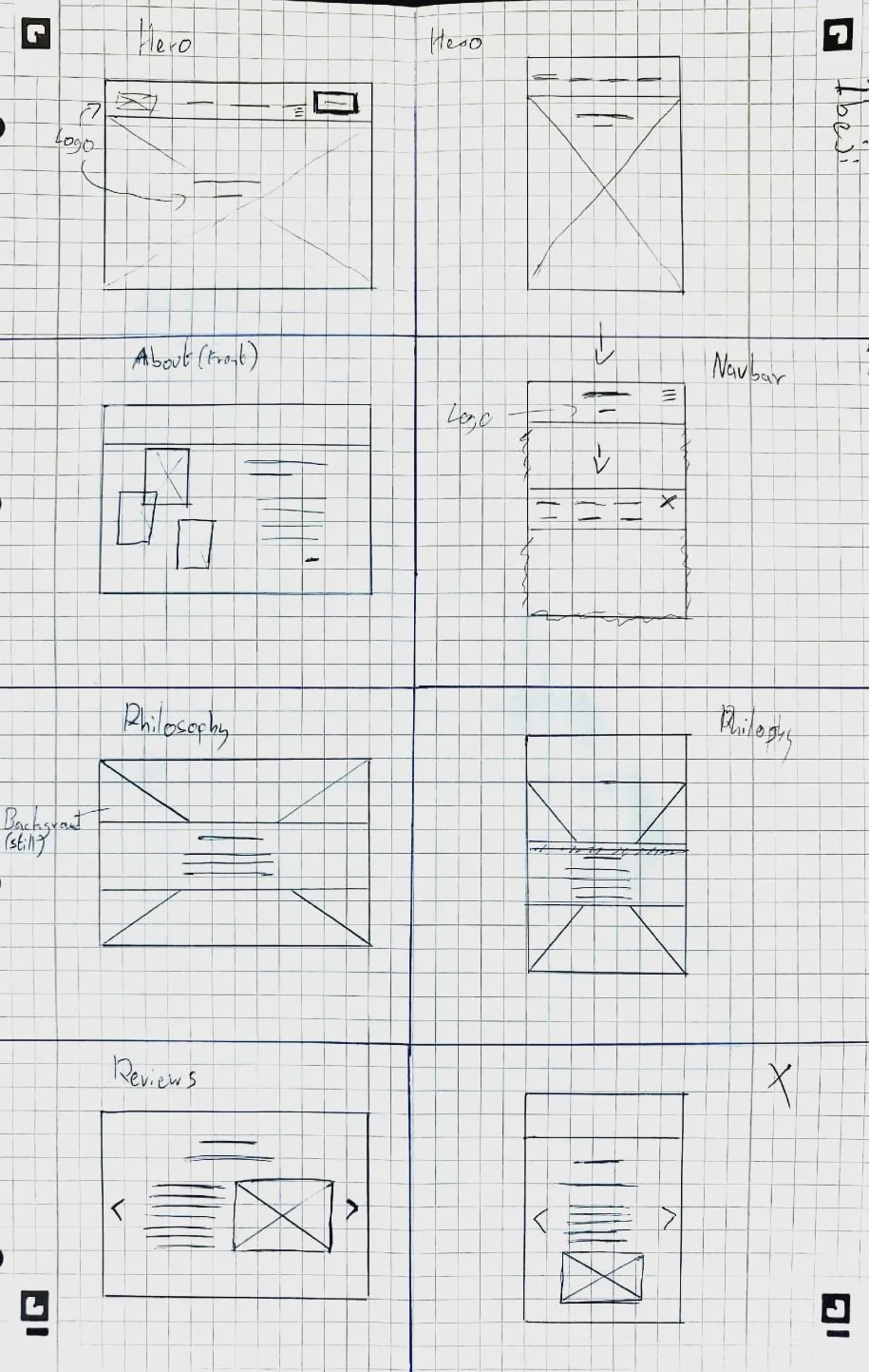
We started with multiple requirements meetings to clarify the client’s goals, audience, and priorities (showcasing work, telling their story, and generating enquiries). For each main page: home, gallery, about, blog, and contact. I created Figma wireframes, iterated on them with the client, and only then moved into implementation so that layout, messaging, and content structure were agreed upfront.
Design & UX
The design focuses on keeping the photography central, using generous whitespace, restrained colour, and typography that matches the client’s “elegant but approachable” brief. Each wireframe was translated into a responsive layout, with attention to how the experience scales from desktop to mobile while keeping navigation simple and predictable.
Technical Implementation
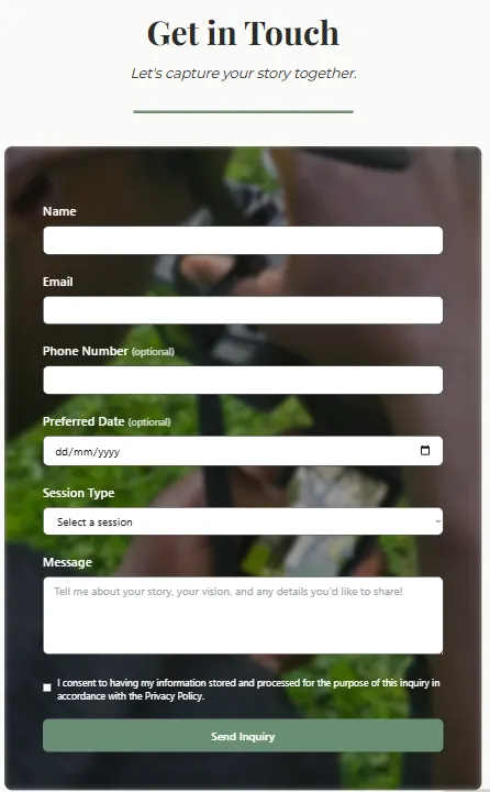
The front end uses Next.js (App Router) with locale-aware routing and translation helpers for multilingual content. A headless Sanity CMS instance powers the blog and gallery, exposing content via its content API so the client can update text and images without touching code. The contact form is wired to a backend handler with spam protection (reCAPTCHA, honeypot, and rate limiting) and email delivery, designed to align with GDPR expectations.
High-resolution imagery is handled with Next.js image optimisation, remote patterns, and multiple quality presets to keep the site fast while still showcasing detailed photography. Several images were resized and compressed, and animations were kept lightweight (transform/opacity) to avoid jank while scrolling.
What I Learned
This project strengthened experience in running a full client process end to end: gathering requirements, turning them into wireframes, validating designs, and then delivering a multilingual, CMS-backed site. It also deepened understanding of performance trade-offs when working with large image assets and of how to keep the implementation faithful to a design system across multiple page types.
Visuals
Wireframes overview
Gallery / front page

Contact form
About me page

Links
Secure Blog Application
A Flask-based blog application built to practice secure web development, implementing encryption at rest, strong authentication, role-based access control, attack detection, and detailed security logging.
Project Overview
The app lets users register, log in with multi-factor authentication, and create, edit, and delete their own blog posts. Posts are stored encrypted in the database, and different user roles (end user, security admin, database admin) have different levels of access to content and admin tooling. Google reCAPTCHA, rate limiting, and custom input validation help protect against bots, brute-force attempts, and common web attacks such as SQL injection and XSS.
Security Features
- Authentication & MFA: Login uses email and password plus a TOTP-based one-time code generated with pyotp, with QR codes to set up the second factor.
- Password Hardening: Passwords are hashed with Argon2, following modern recommendations for secure password storage.
- Role-Based Access Control (RBAC): Roles such as end_user, sec_admin, and db_admin control access to admin views, security dashboards, and data operations.
- Encryption at Rest: Sensitive blog fields (like titles and bodies) are encrypted using keys derived from user-specific data so that content is protected even if the database is leaked.
- Bot & Abuse Protection: Login routes are protected with Google reCAPTCHA, rate limits, and login attempt tracking to slow down automated attacks and brute force.
- Attack Detection & Input Validation: Inputs are scanned for SQL injection, XSS, and path traversal patterns, with strict validation for emails, phone numbers, and names.
- Security Headers & HTTPS: Flask-Talisman enforces HTTPS and sets security headers such as HSTS and Content Security Policy to reduce XSS and downgrade risks.
Technical Implementation
- Stack & Architecture: Built with Flask using blueprints in an MVC-style structure, SQLAlchemy for ORM, and Alembic/Flask-Migrate for database migrations on top of SQLite.
- Models & OOP Design: User, Post, and Log models encapsulate authentication, encryption, logging, and relationships, with methods for verifying passwords/MFA, encrypting/decrypting data, and tracking login history.
- Forms & Validation: Flask-WTF and WTForms define registration, login, and post forms, including the reCAPTCHA field on login and server-side validation rules for all fields.
- Admin & Monitoring: Flask-Admin provides restricted views for managing users and posts, while security events (registrations, logins, attacks, blocked access) are written to a dedicated log file for auditing.
- Front End: Jinja templates use Bootstrap and small amounts of JavaScript/jQuery for layout, feedback, and form behaviour.
What I Learned
This project provided hands-on experience with implementing multiple layers of security in a real web app rather than treating each feature in isolation. It strengthened skills in Flask, authentication flows, encryption, RBAC design, and logging, and showed how important it is to think about both user experience (MFA, error messages, reCAPTCHA) and attacker behaviour (brute force, injection, scripting) when building production-like systems.
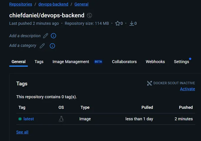
DevOps Web Application
A three-tier web application built to demonstrate the core principles of DevOps culture — combining automation, scalability, collaboration, and continuous delivery throughout its architecture and workflows.
The system functions as an internal chat platform paired with a dashboard displaying live GitHub project metrics to help development teams coordinate effectively. It was designed using containerized microservices and follows modern DevOps best practices from build to deployment.
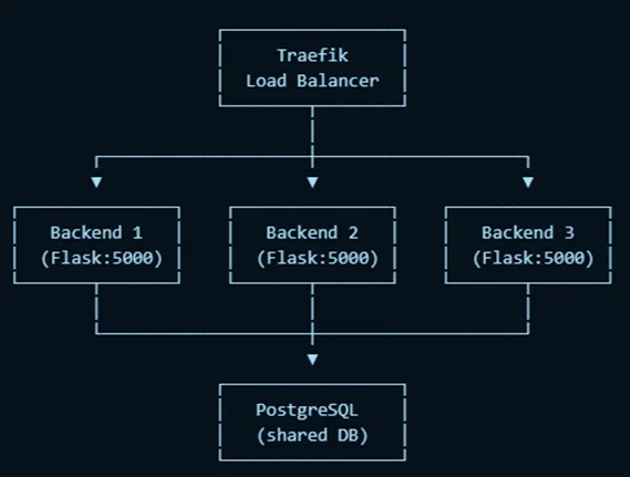
System Overview
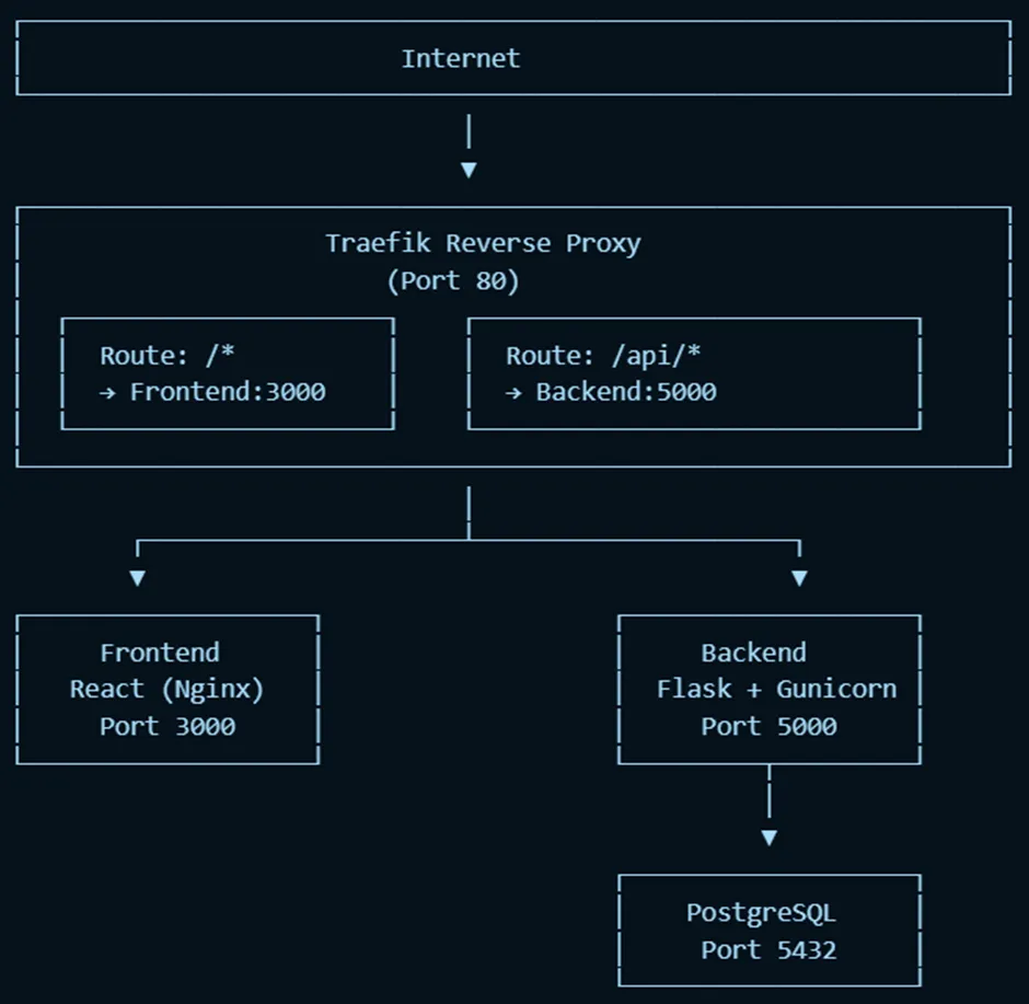
The application uses a three-tier architecture:
- Frontend: React SPA
- Backend: Flask API
- Database: PostgreSQL
All tiers run in separate Docker containers, connected via Docker Compose.
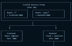
A Traefik reverse proxy sits at the edge of the system, routing traffic to the correct service internally:
/ → frontend (port 3000)/api/... → backend (port 5000)
This design provides scalability and isolation while ensuring consistent deployments across environments.
Architecture Diagram:
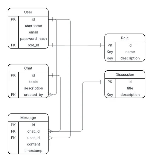
Database Schema:
Frontend: React SPA
React was chosen for its reusable component structure, efficient state management, and virtual DOM rendering — ideal for chat messages and live dashboards. It also simplifies building single-page applications with smooth client-side routing.
Backend: Flask
Flask powers the RESTful API, handling authentication, chat functionality, and metrics retrieval. Its lightweight, modular design (using the create_app() pattern and blueprints) promotes maintainability and aligns well with testing and observability goals.
Database: PostgreSQL
PostgreSQL stores structured data such as users, messages, and chat logs, using foreign keys and JSON fields for flexible relationships. It integrates seamlessly with SQLAlchemy and runs as an official Docker image.
Reverse Proxy: Traefik
Traefik routes and monitors HTTP traffic while automatically discovering backend services based on Docker labels. Compared to Nginx, it requires no manual reconfiguration during restarts, making it ideal for agile, containerized workflows.
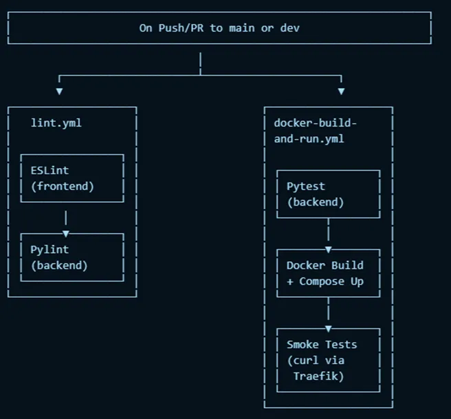
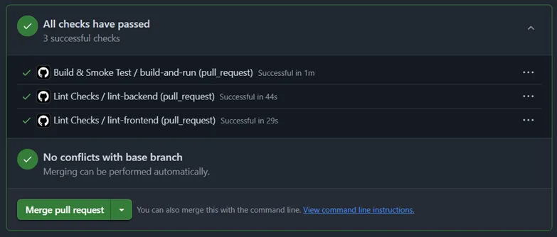
CI/CD and DevOps Practices
Continuous Integration
GitHub Actions runs automated pipelines on every push or pull request:
- ESLint for frontend code quality
- Pylint and Pytest for backend testing
- Smoke tests that spin up the full stack, verify container connectivity, and call endpoints using
curl
Deployment & Infrastructure as Code
Local deployment is defined through a single docker-compose.yml that brings up all services and networking with one command (docker compose up --build).
For cloud deployment, the backend image was pushed to Docker Hub and run via Azure Container Instances (ACI).
Future goals include implementing full Infrastructure-as-Code using Bicep or Terraform for repeatable cloud provisioning.
CI/CD Overview:
Maintainability & Scalability
- Maintainability: Flask’s modular blueprints and feature-branch workflow ensure separation of responsibilities and easier updates.
- Scalability: Horizontal scaling supported through Docker Compose (
--scale backend=n), with Traefik handling load balancing automatically.
- Cloud Readiness: Vertical scaling handled by adjusting ACI CPU and memory allocations, while PostgreSQL can migrate to a managed service for reliability.
Scaling Diagram:
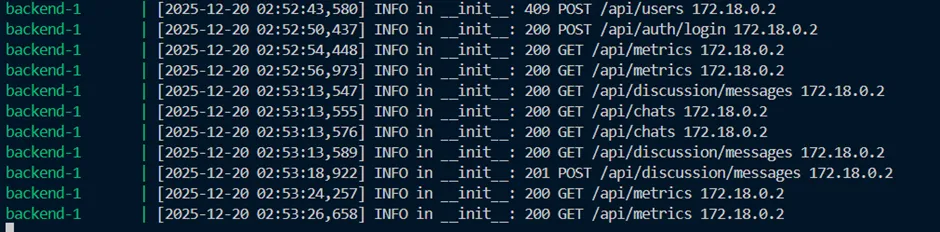
Observability
System observability was achieved through structured logging in Flask using Python’s logging module. Each request is logged with timestamp, method, path, status, and IP, forming a complete audit trail.
Logs can be viewed both locally (docker logs) and in Azure deployments using container insights.
Example Logs:
Security
Security features implemented include:
- Hashed Passwords: Using bcrypt for password storage
- Environment Secrets: Managed via local
.env excluded from version control
- Bot Protection: Login form integrates Google reCAPTCHA
- Future Enhancements: Role-based access control (RBAC) and rate limiting for brute-force protection
Evaluation & Reflection
This project successfully integrated DevOps fundamentals — containerization, CI/CD, testing, and observability — into a cohesive system.
It strengthened my understanding of how to connect microservices, orchestrate pipelines, and debug containerized environments.
Key wins:
- Seamless container orchestration with Docker and Traefik
- Fully automated CI workflows
- Scalable architecture ready for cloud migration
Lessons learned:
- Early missteps with frontend framework selection (initially using Tkinter) delayed progress, but switching to React paid off enormously.
- Understanding Docker’s benefits firsthand made the deployment workflow clearer.
Future improvements:
- Expand test coverage (frontend + integration tests)
- Add RBAC and rate limiting
- Replace manual Azure CLI configuration with Terraform IaC templates
Visuals
CI Workflow Passing Tests
Local Deployment Verification
Links
- GitHub Repository under university organization
Gaze-Guided Remote Camera (DurHackX 2025)
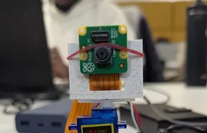
At DurHackX 2025, our team built a remote camera system that mimics the experience of looking through a window by moving a physical camera based on the viewer’s head position.
Project Overview
The system uses a camera mounted on a servo-driven Raspberry Pi as a remote “window” into another space. On the client side, a laptop tracks the user’s face with MediaPipe and sends head-position data to the Raspberry Pi, which turns the camera in the opposite direction. As you move your head, the camera adjusts, making it feel like you are looking around the remote environment in real time. To improve accessibility, the system also uses the Gemini API to generate textual descriptions of what the camera sees and reads them aloud via text-to-speech.
Key Features
- Gaze-Based Camera Control: Face tracking on the client controls the camera angle, creating a natural “look-around” effect.
- Remote Exploration: Users can explore a physical environment remotely through live video and audio descriptions.
- Accessibility Focus: Designed with physically impaired users in mind, offering both visual and spoken descriptions of the scene.
- Hackathon-Ready Implementation: Built end-to-end in a weekend, from hardware setup to API design and front-end interface.
Technical Implementation
- Frontend: React-based interface running on a laptop, integrating MediaPipe for real-time face tracking and sending head-position data to the backend.
- Backend: Flask API that receives face tracking data, calculates the appropriate servo angle, and forwards commands to the Raspberry Pi.
- Hardware: Raspberry Pi controlling a servo-mounted camera, translating API commands into smooth physical camera movement.
- AI Integration: Gemini API used to generate descriptions of the camera feed, which are then converted to speech to narrate the scene to the user.
Challenges & Solutions
One of the main challenges was converting raw face tracking data into stable camera movement. Early versions were jittery and oversensitive to small head movements. To address this, the team refined the mapping and smoothing logic, adjusting the calculations and adding constraints so the servo responded more predictably and comfortably. There were also hardware timing and latency issues between the laptop, API, and Raspberry Pi, which were mitigated by tuning update intervals and simplifying the control loop.
Impact
The prototype demonstrates how computer vision, lightweight hardware, and AI can combine to give users with limited mobility a more intuitive way to explore remote spaces. It also highlights practical experience in bridging frontend, backend, and embedded systems under time constraints.
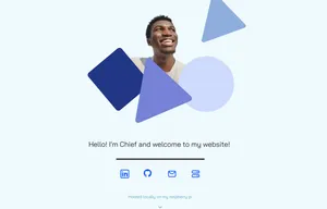
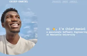
Portfolio Website
A fully responsive portfolio website built with modern web technologies, designed to showcase my projects and technical skills in an elegant and user-friendly way.
Why Astro?
I chose Astro because it is lightweight and produces highly optimized static HTML with minimal JavaScript. This makes it ideal for running on resource-constrained devices like my Raspberry Pi, ensuring fast load times and low resource use. Astro’s island architecture allows me to sprinkle interactivity only where needed without bloating the site.
Cloudflare Tunnel Setup
To expose my website securely while hosting it on a Raspberry Pi behind restrictive accommodation WiFi (without port forwarding), I used a Cloudflare Tunnel. This provides a robust and secure public URL for my portfolio without the hassle of complex network configuration.
Portfolio Research Insights
When designing the site, I researched what visitors typically want from a portfolio page. The main takeaways were: visitors expect quick access to the most impressive and relevant projects upfront, concise project descriptions showcasing technical contributions, clear technology stacks, real-world outcomes, and easy navigation to additional work for breadth. This guided the site’s content hierarchy and project presentation.
Key Features
- Responsive Design: Works seamlessly across all devices and screen sizes
- Performance Optimized: Built with Astro for lightning-fast page loads
- Content Collections: Uses Astro’s content collections for easy project management
- Modal System: Interactive modal popups for project details
- Smooth Animations: Subtle transitions and hover effects throughout
Technical Implementation
The site leverages Astro’s static site generation combined with Tailwind CSS for styling.
Architecture
- Static site generation for optimal performance
- Component-based architecture for maintainability
- Content collections for type-safe content management
Styling Approach
Before settling on the final design, I created multiple wireframes and prototypes in Figma to explore layout, color schemes, and user experience options. This iterative process informed the clean visual structure and consistent branding seen on the site.
/* Custom color system */
—color-Primary1: #5caac3;
—color-Primary2: #06164f;
—color-Background1: #effafc;
—color-Background2: #daebfc;
- Minimal JavaScript footprint
- Optimized image loading
- CSS-only animations where possible
Challenges & Solutions
One interesting challenge was implementing the modal system without using dynamic routes. The solution involved:
- Pre-loading all project content using
getCollection()
- Rendering modal content client-side using Astro’s
<Content /> component
- Managing modal state with vanilla JavaScript
Future Enhancements
- Add blog section with content collections
- Implement dark mode toggle
- Add contact/feedback form with email integration
- Integrate analytics
Links
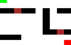
AI Hunter
AI Hunter was built at one of my first hackathons in Sheffield as part of a team of four. The idea I proposed was a game where an AI-controlled hunter adapts to the player’s movements and strategies while trying to catch them on a simple 2D map.
Project Overview
The core mechanic is an AI that learns from the player’s movement patterns and adjusts its chasing behavior over time. The game world is represented as a grid, with black blocks as walls, green as the player, light red as the hunter, and dark red as doors. We initially planned extra mechanics such as items (for example, flashbangs) to help the player escape, but within the hackathon timeframe we focused on getting the adaptive chasing behavior working.
Key Features
- Adaptive AI Behavior: The hunter responds to how the player moves, rather than following a fixed path.
- Real-Time Pursuit: Player and hunter move in real time, with the AI updating its behavior as it gathers more information.
Links
First Portfolio Website
This was the first portfolio site built from scratch with just HTML, CSS, and JavaScript, and it was the first place where others could see my work in a structured way.
Project Overview
The site is a single-page portfolio with sections for projects, about, and contact. Navigation is handled client-side: clicking different sections updates the visible content without reloading the page, creating a simple SPA-like experience using only vanilla JavaScript. This project represents an important milestone in turning basic web skills into something complete and publicly usable.
Key Features
- Custom Navigation: A JavaScript-driven navigation system that shows and hides sections dynamically without page reloads.
- Interactive Project Section: Expandable project entries so visitors can reveal more details on demand.
- Responsive Layout: CSS media queries and flexible layouts to make the site usable on both desktop and mobile.
- Smooth Visuals: Hover effects, transitions, shadows, and transforms to make interactions feel more polished.
Technical Implementation
- HTML & Structure: Semantic sections for content, with clear separation of navigation, projects, and about information.
- CSS & Layout: Flexbox-based layout, use of viewport units for scalable typography, and iterative styling to get spacing and alignment right.
- JavaScript Logic: DOM manipulation and event listeners to toggle sections, handle project expansion, and update styles based on user interaction.
Challenges & What I Learned
Styling was the hardest part: there was a lot of trial and error, repeatedly adding and removing CSS until elements looked and behaved as intended. That process taught careful use of flexbox, responsive units, and how small changes in CSS can affect the entire layout. This project now serves as a snapshot of where I started and how my approach to structure, design, and code quality has evolved.
Visuals
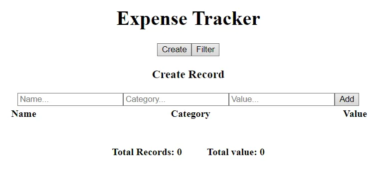
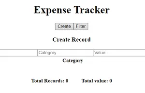
React Fundamentals: Counter & Expense Tracker
These two projects were built back-to-back to learn React from the ground up: starting with a simple counter to understand state and events, then moving to an expense tracker to practice passing data between components and managing more complex UI state.
Project Overview
The Counter app was the first React project and focused on core ideas like useState, event handling, and rendering state changes in real time. The Expense Tracker followed as a second project, where the goal was to move beyond a single component and use props and context to connect multiple parts of the application (inputs, filters, and summary).
Key Features
-
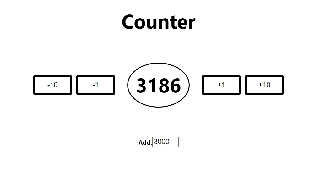
Counter App
- Increment and decrement controls, including larger step changes via buttons.
- Custom input to adjust the counter directly.
- Simple layout designed to keep attention on state updates and interaction logic.
-
Expense Tracker
- Add new expense records with relevant fields.
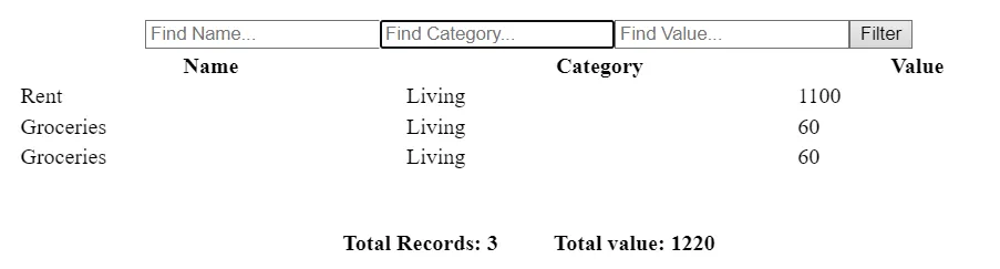
- Filter expenses by name, category, and value to narrow down records.
- Toggle between “create” and “filter” modes for a cleaner interface.
- Display total number of records and aggregate expense value.
Technical Implementation
- React & State Management: Used
useState to manage the counter value and expense data, updating the UI instantly when values change.
- Components & Data Flow: Split the Expense Tracker into components for inputs, filters, and summaries, passing data via props and, where needed, context to avoid excessive prop drilling.
- HTML/CSS Foundations: Built the UI with hand-written HTML and CSS, including responsive layout work and layout tweaks as more elements were added.
- Planning & Structure: For the Expense Tracker, sketched out component structure and data flow before writing code to avoid confusion once the app grew beyond a single component.
Challenges & What I Learned
The main difficulty in the Expense Tracker was passing data cleanly between components and deciding where state should live so each part of the UI had the data it needed without duplication. Both projects also highlighted how quickly layout and styling become more complex as features are added, which pushed a more deliberate approach to planning structure and CSS instead of adjusting everything ad hoc.
Future Improvements
Potential next steps include adding edit and delete capabilities to the Expense Tracker, improving the styling of both apps, and persisting data (for example, with local or session storage) so values survive page reloads. These changes would make the projects feel closer to production tools while continuing to build on the same React fundamentals.
Visuals
Links